


Provincial Health Services Authority, the problem, how do you redesign the PHSA site as well as 20 plus branches that fall under PHSA, and somehow make them cohesive. The solution, instead of relying on stock photography that has been overused in healthcare, and is is fairly generic, create a family of abstract patterns that use each organizations colours and brand.
Providence Living, Our work with Providence was to reimagine senior’s care, to add art, to research color, and how senior’s respond to it. The result was a new brand that features brand illustrations designed to fit from the ceiling to floor. Each illustration also has areas where sections can be used as individual prints, use bright & bold where the residents can be visually stimulated, like eating and recreational areas. Use soothing cooler tones in areas where patients are looking for rest and tranquility near the end of the day.


The commonality of all three illustrations is the appearance of our bike rider. The person is nondescript and seems to be part of each landscape. Seniors may discover the person and relate to memories of thier own. Each illustration may be interpreted as past experiences of interacting with nature. The elements of each illustration will have 2 or three sections. Active or bright where the elements are visually active or “busy” followed by flat color and then quiet areas that will typically make up close to half the illustration.

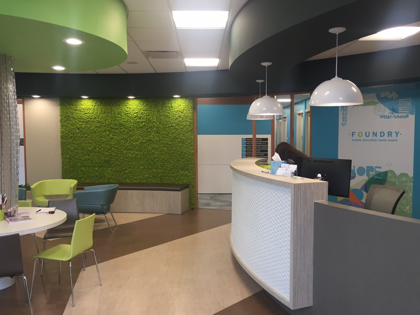


Foundry, brand,
website, environments
foundrybc.ca
Royal Columbian, brand, website, campaigns
rchfoundation.com


BC Nurses Union, brand, online annual reports: bcnu.org/report/2016/
St. Paul’s, brand, website, campaigns: helpstpauls.com


Providence Mission Forward, brand, strategic plan, website: missionforward.ca


The Way Forward, Palliative Care in Canada Reports, video


BC Cancer Agency, campaigns, videos
Thanks, for more information don’t hesitate to email us at johnrbelisle@telus.net